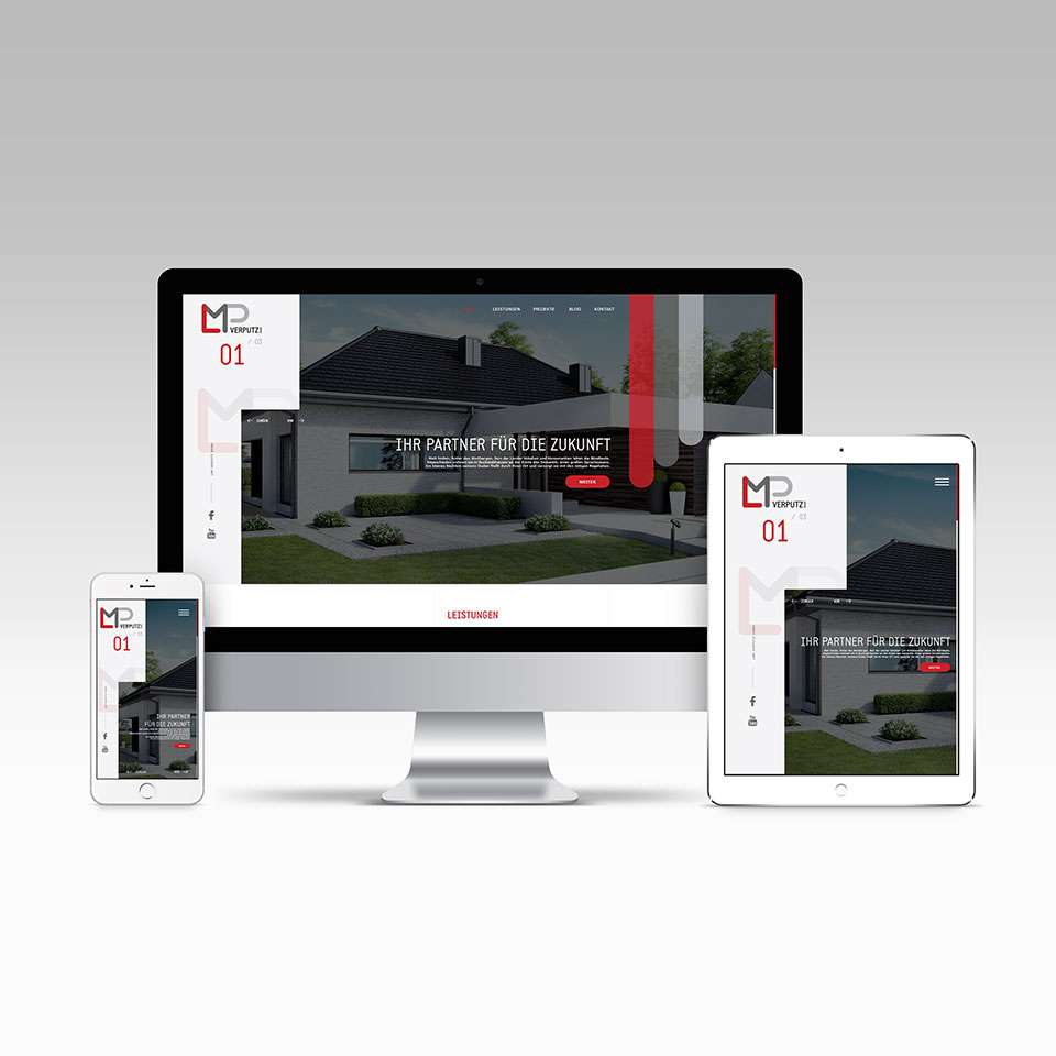
LMP Corporate Design and Webdesign
Those three letters LMP stand for 3 Short names of the founders. The long name forms were cut short to a simple LMP with its signature three colors icon. The monogram has been refined for greater clarity and ease of use. The new logo has been designed to ensure consistency and recall across all touch-points. The revamped logo is more in sync with today’s generation and technology and shows LMP as a modern, serious company which is rapidly growing.